
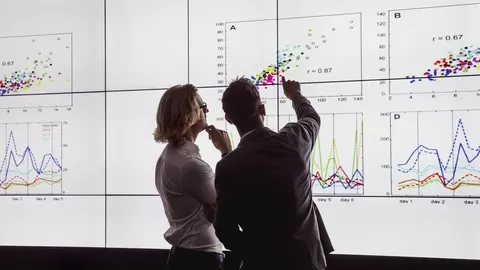

Matplotlib is a multi-platform data visualization tool for creating advanced-level and interactive data visualizations that showcase insights from your datasets. One of Matplotlib’s most important features is its ability to work well with many operating systems and graphics backends. Matplotlib helps in customizing your data plots, building 3D plots and tackling real-world data with ease. Python’s elegant syntax and dynamic typing, along with its interpreted nature, make it a perfect language for data visualization. If you’re a Python Developer or a data scientist looking to create advanced-level Data Visualizations that showcase insights from your datasets with Matplotlib 3, then this Course is perfect for you!
This comprehensive 4-in-1 course follows a step-by-step approach to entering the world of data Visualization with Python and Matplotlib 3. To begin with, you’ll use various aspects of data visualization with Matplotlib to construct different types of plot such as lines and scatters, bar plots, and histograms. You’ll use Matplotlib 3’s animation and interactive capabilities to spice up your data visualizations with a real-world dataset of stocks. Finally, you’ll master Matplotlib by exploring the advanced features and making complex data visualization concepts seem very easy.
By the end of the course, you’ll become a data visualizations expert with Matplotlib 3 by learning effective and practical data visualization recipes.
Contents and Overview
This training program includes 4 complete courses, carefully chosen to give you the most comprehensive training possible.
The first course, Matplotlib for Python Developers, covers understanding the basic fundamentals of plotting and data visualization using Matplotlib. In this course, we hit the ground running and quickly learn how to make beautiful, illuminating figures with Matplotlib and a handful of other Python tools. We understand data dimensionality and set up an environment by beginning with basic plots. We enter into the exciting world of data visualization and plotting. You’ll work with line and scatter plots and construct bar plots and histograms. You’ll also explore images, contours, and histograms in depth. Plot scaffolding is a very interesting topic wherein you’ll be taken through axes and figures to help you design excellent plots. You’ll learn how to control axes and ticks, and change fonts and colors. You’ll work on backends and transformations. Then lastly you’ll explore the most important companions for Matplotlib, Pandas, and Jupyter used widely for data manipulation, analysis, and visualization. By the end of this course, you’ll be able to construct effective and beautiful data plots using the Matplotlib library for the Python programming language.
The second course, Developing Advanced Plots with Matplotlib, covers exploring advanced plots and functions with Matplotlib. In this video course, you’ll get hands-on with customizing your data plots with the help of Matplotlib. You’ll start with customizing plots, making a handful of special-purpose plots, and building 3D plots. You’ll explore non-trivial layouts, Pylab customization, and more on tile configuration. You’ll be able to add text, put lines in plots, and also handle polygons, shapes, and annotations. Non-Cartesian and vector plots are exciting to construct, and you’ll explore them further in this tutorial. You’ll delve into niche plots and visualizing ordinal and tabular data. In this video, you’ll be exploring 3D plotting, one of the best features when it comes to 3D data visualization, along with Jupyter Notebook, widgets, and creating movies for enhanced data representation. Geospatial plotting will be also be explored. Finally, you’ll learn how to create interactive plots with the help of Jupyter. By the end of this video tutorial, you’ll be able to construct advanced plots with additional customization techniques and 3D plot types.
The third course, Data Visualization Recipes with Python and Matplotlib 3, covers practical recipes for creating interactive data visualizations easily with Matplotlib 3. This course cuts down all the complexities and unnecessary details. It boils it down to the things you really need to get those visualizations going quickly and efficiently. The course gives you practical recipes to do what exactly needs to be done in the minimum amount of time. All the examples are based on real-world data with practical visualization solutions. By the end of the course, you’ll be able to get the most out of data visualizations where Matplotlib 3 is concerned.
The fourth course, Mastering Matplotlib 3, covers mastering the power of data visualization with Matplotlib 3. This course will help you delve into the latest version of Matplotlib, 3, in a step-by-step and engaging manner. Through this course, you will master advanced Matplotlib concepts and will be able to tackle any Data Visualization project with ease and with increasing complexity. By the end of the course, you will have honed your expertise and mastered data visualization using the full potential of Matplotlib 3.
By the end of the course, you’ll become a data visualizations expert with Matplotlib 3 by learning effective and practical data visualization recipes.
About the Authors
•Benjamin Keller is currently a Ph.D. candidate at McMaster University and achieved his BSc in Physics with a minor in Computer Science from the University of Calgary in 2011. His current research involves numerical modeling of galaxy evolution over cosmological timescales. As an undergraduate at the U of C, he worked on stacking radio polarization to examine faint extragalactic sources. He also worked in the POSSUM Working Group 2 to determine the requirements for stacking applications for the Australian SKA Pathfinder (ASKAP) radio telescope. His current research is focused on developing and improving subgrid models used in simulations of galaxy formation and evolution. He is particularly interested in questions involving stellar feedback (supernovae, stellar winds, and so on) and its impact on galaxies and their surrounding intergalactic medium.
•Harish Garg is a co-founder and software professional with more than 18 years of software industry experience. He currently runs a software consultancy that specializes in the data analytics and data science domain. He has been programming in Python for more than 12 years and has been using Python for data analytics and data science for 6 years. He has developed numerous courses in the data science domain and has also published a book involving data science with Python, including Matplotlib.
•Amaya Nayak is a Data Science Domain consultant with BignumWorks Software LLP. She has more than 10 years’ experience in the fields of Python programming, data analysis, and visualization using Python and JavaScript, using tools such as D3.js, Matplotlib, ggplot, and more. With over 5 years’ experience as a data scientist, she works on various data analysis tasks such as statistical data, data munging, data extraction, data visualization, and data validation.