Disclosure: when you buy through links on our site, we may earn an affiliate commission.

Data Analytics: Python Visualizations

Enrich Data Science, ML and Analytics with powerful Visualisations using Matplatlib, Seaborn and Bokeh
4.5
4.5/5
(30 reviews)
574 students
Created by

9.1

CourseMarks Score®

9.1

Freshness

8.3

Feedback

9.2

Content

Platform: Udemy
Video: 6h 24m
Language: English
Next start: On Demand

Top Data Visualization courses:

Detailed Analysis

CourseMarks Score®

9.1 / 10

CourseMarks Score® helps students to find the best classes. We aggregate 18 factors, including freshness, student feedback and content diversity.

Freshness Score

9.1 / 10
This course was last updated on 7/2021.

Course content can become outdated quite quickly. After analysing 71,530 courses, we found that the highest rated courses are updated every year. If a course has not been updated for more than 2 years, you should carefully evaluate the course before enrolling.

Student Feedback

8.3 / 10
We analyzed factors such as the rating (4.5/5) and the ratio between the number of reviews and the number of students, which is a great signal of student commitment.

New courses are hard to evaluate because there are no or just a few student ratings, but Student Feedback Score helps you find great courses even with fewer reviews.

Content Score

9.2 / 10
Video Score: 8.5 / 10
The course includes 6h 24m video content. Courses with more videos usually have a higher average rating. We have found that the sweet spot is 16 hours of video, which is long enough to teach a topic comprehensively, but not overwhelming. Courses over 16 hours of video gets the maximum score.
The average video length is 5 hours 08 minutes of 163 Data Visualization courses on Udemy.
Detail Score: 9.6 / 10

The top online course contains a detailed description of the course, what you will learn and also a detailed description about the instructor.

Extra Content Score: 9.5 / 10

Tests, exercises, articles and other resources help students to better understand and deepen their understanding of the topic.

This course contains:

0 article.
2 resources.
0 exercise.
0 test.

Table of contents

Description

If you are working on Data Science projects and want to create powerful Visualization and Insights as outcome from your projects, this course is for you!!!
If you are working on Machine Learning Projects and want to find patterns and insights from your Data on your way to building Models, this course is for you!!!
If you are a Business Analyst or Functional Analyst and want to build powerful Visualizations for your stakeholders, this course is for you!!
= = = = = = >>> >>
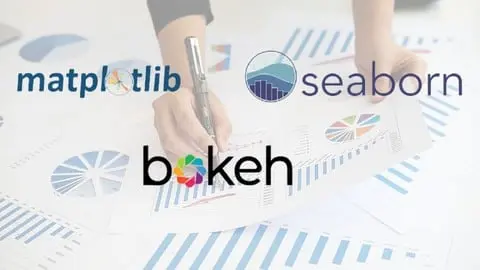
This course is exclusively focused on explaining how to build fantastic Visualizations using Python. Covers more than 20 types of Visualizations using the most popular Python Visualization Libraries Matplotlib, Seaborn and Bokeh. It covers Data Analytics that leads to building these visualizations so that the learners understand the flow of analysis to insights.
This course takes a holistic approach towards teaching Visualizations:
– Take real-life, business scenarios and raw data to go through detailed Exploratory Data Analysis (EDA) techniques to prepare your raw data to suit the appropriate Visualization needs.
– Data Analytics and Exploratory Data Analysis Techniques using multiple different data structures using Numpy and Pandas libraries.
– Explain Chart/Graph types, customization/configuration and vectorization techniques.
– Throughout the course, extensive amount of Code demo along with concepts as a balanced approach to teaching.
– Every concept is taught by going deeper into foundational techniques and deeper customizations on Visualizations.
Extensive Quizzes are infused at logical points to validate the learning effectiveness.
[NOTE: All the code used in the Lectures are attached as downloadable resources. You may download them and try out while going through the lectures.]

You will learn

✓ In depth coverage of Matplotlib, Seaborn and Bokeh Visualization Libraries.
✓ Easy, step by step explanations with code to draw over 20 different kinds of Charts and Graphs using Python.
✓ Extensive amount of Python – Matplotlib/Seaborn/Bokeh code used in the course are attached as downloadable resources for you to try out while you learn.
✓ Use of Data Analytics Techniques / Exploratory Data Analysis (EDA) using several Data Generation and Manipulation Methods.
✓ Extensive coverage of NumPy and Pandas Data capabilities using Python.
✓ Learn the art of presenting Data in the form of Powerful, Innovative and Intuitive Visualisations that your stakeholders will love.
✓ Application of Business and real-life Scenatios to create Visualisations.

Requirements

• Basic understanding of Python will be helpful, however not mandatory.

This course is for

• Python, Machine Learning Developers
• Data Scientists
• Data Analysts
• Big Data Professionals
• Business Analysts
• Leaders, Managers, anyone whose job involves presenting Data in the form of Visuals
• Techno-Functional Analysts
• Developers
• Architects
• Systems Analysts
• Anyone who is in a role in handling and managing Data

How much does the Data Analytics: Python Visualizations course cost? Is it worth it?

The course costs $14.99. And currently there is a 82% discount on the original price of the course, which was $84.99. So you save $70 if you enroll the course now.
The average price is $16.0 of 163 Data Visualization courses. So this course is 6% cheaper than the average Data Visualization course on Udemy.

Does the Data Analytics: Python Visualizations course have a money back guarantee or refund policy?

YES, Data Analytics: Python Visualizations has a 30-day money back guarantee. The 30-day refund policy is designed to allow students to study without risk.

Are there any SCHOLARSHIPS for this course?

Currently we could not find a scholarship for the Data Analytics: Python Visualizations course, but there is a $70 discount from the original price ($84.99). So the current price is just $14.99.

Who is the instructor? Is Manas Dasgupta a SCAM or a TRUSTED instructor?

Manas Dasgupta has created 3 courses that got 71 reviews which are generally positive. Manas Dasgupta has taught 964 students and received a 4.1 average review out of 71 reviews. Depending on the information available, Manas Dasgupta is a TRUSTED instructor.
IT Leader, Machine Learning Trainer
I hold a Master’s Degree (MSc) from the Liverpool John Moores University (LJMU), UK on Artificial Intelligence and Machine Learning (AI/ML).
My specialization and research areas are Natural Language Processing (NLP) using Deep Learning Methods such as Siamese Networks, Encoder-Decoder techniques, various Language Embedding methods such as BERT, areas such as Supervised Learning on Semantic Similarity and so on.
My expertise area also encompass an array of Machine Learning and Data Science / Predictive Analytics areas including various Supervised, Unsupervised and Clustering methods. 
I have > 20 Years of experience in the IT Industry, mostly with the Financial Services domain. Starting as a Developer to being an Architect for a number of Years to Leadership position. Key focus and passion is to increase technical breadth and innovation.

9.1

CourseMarks Score®

9.1

Freshness

8.3

Feedback

9.2

Content

Platform: Udemy
Video: 6h 24m
Language: English
Next start: On Demand

Students are also interested in

Review widget (for course creators):

Data Analytics: Python Visualizations rating
Code for the widget (just copy and paste it to your site):
<a href="https://coursemarks.com/course/data-analytics-python-visualizations/" target="_blank" title="Data Analytics: Python Visualizations on Coursemarks.com"><img border="0" src="https://coursemarks.com/widget/91.svg" width="200px" alt="Data Analytics: Python Visualizations rating"/></a>